USER FLOW
Creative Agency Reimagined
Project Concept Label
FRAMER, UI/UX Design, Website
Project Type
INTRODUCTION
Agencify approached us with a clear goal: to move beyond their outdated, generic visual identity and present themselves as the bold, creative powerhouse they truly are. While their design talent was undeniable, their digital presence didn’t reflect it. The brand lacked consistency, cohesion, and clarity. Our mission was not just to give them a new face, but to build a flexible visual system that would scale as they grew, resonate with their target audience, and establish a distinct voice in a competitive market.
DESIGNING METHOD
We didn’t just redesign their website — we redefined how they communicate their brand. The foundation was a modular UI system that could support any type of content, from service pages to in-depth case studies. Animations were subtle yet purposeful, ensuring interactivity without overwhelming the user.
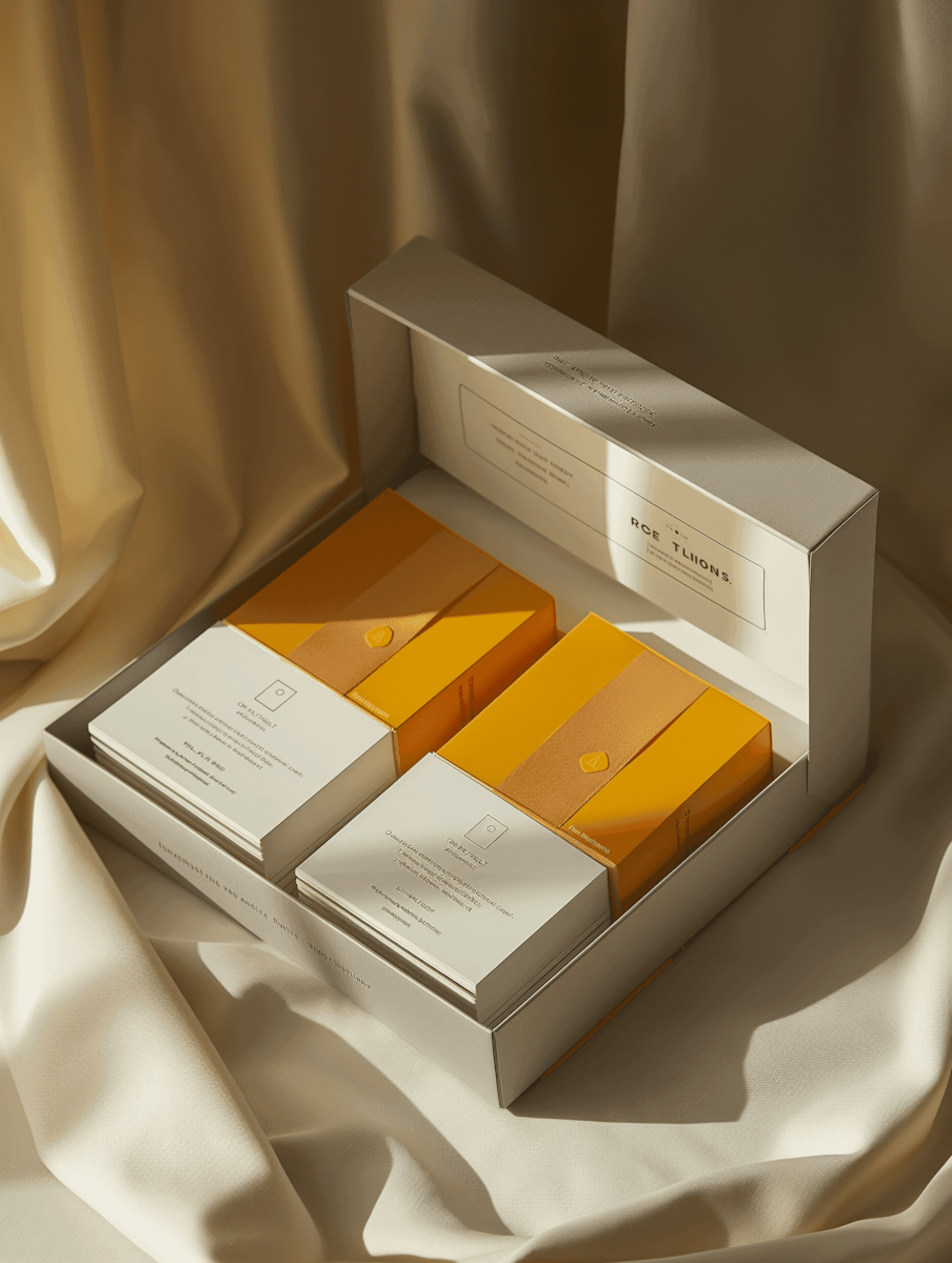
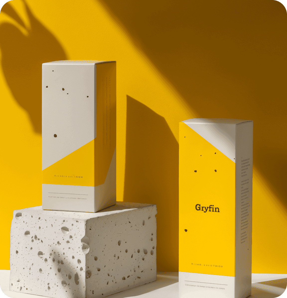
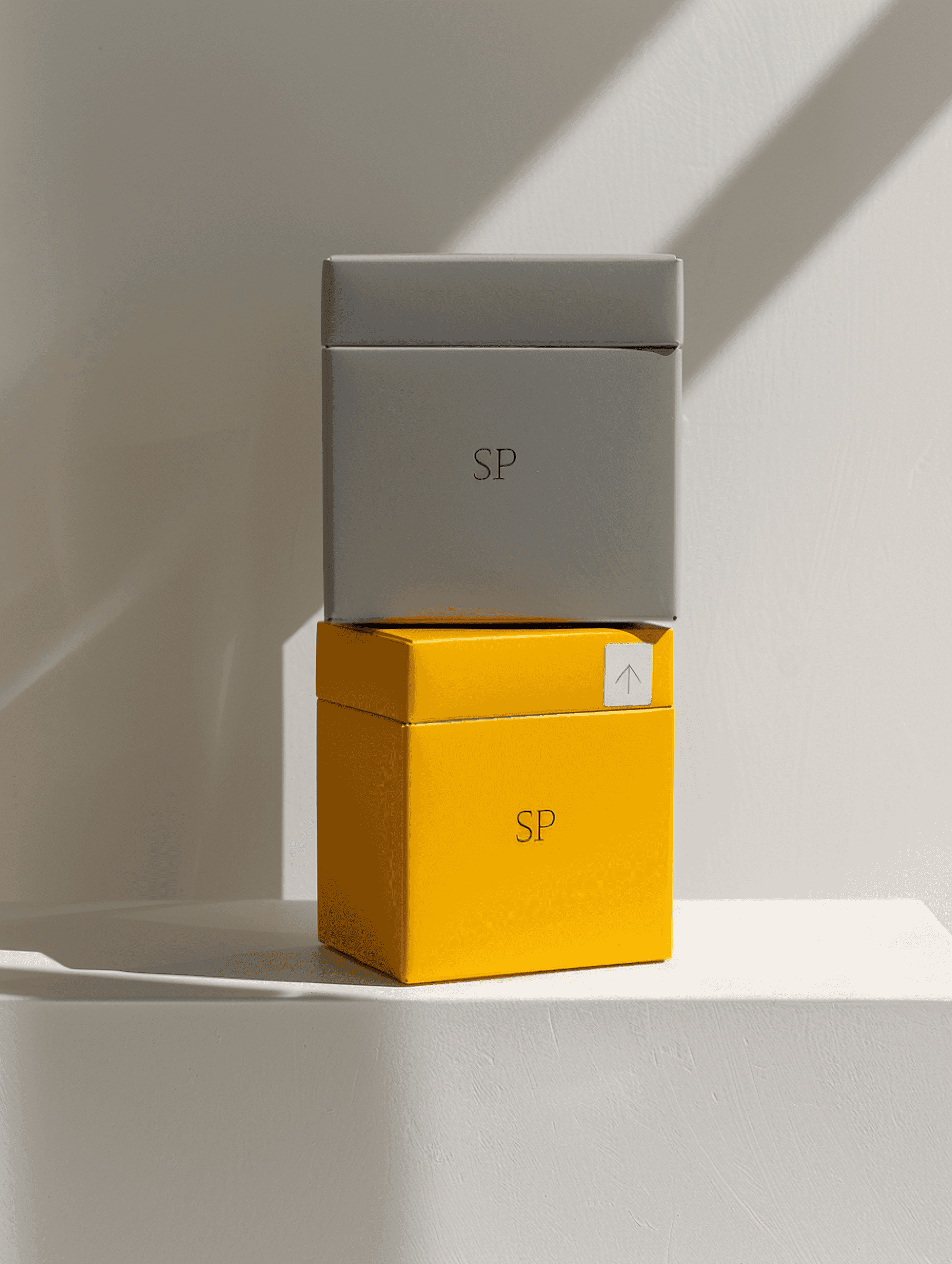
Typography played a critical role: bold sans-serif fonts were chosen for structure, while custom icons and micro-interactions brought moments of delight throughout the site. Color gradients and layering added energy without clutter. Every design choice was intentional, striking the balance between creativity and usability.

FINAL PERFORMANCE
The transformation delivered results across the board. Within just three months post-launch, the agency reported a 60% increase in client inquiries. Social engagement spiked thanks to a consistent visual language and more engaging digital assets. Internally, the rebrand reignited a sense of pride and professionalism across their team. Their pitch decks felt tighter, proposals more aligned, and the overall brand presence felt bold and unmistakable. It wasn’t just a new site — it was a new chapter for Agencify.