AGENCIFY
Creative Agency Reimagined
Project Concept Label
FRAMER, UI/UX Design, Website
Project Type
INTRODUCTION
Agencify came to us with a more bold missions to break away from their generic visual identity and truly represent their creative firepower. As a growing design a agency they had the talent and work but lacked a cohesive ownable brand. Their logo felt outdated, their colors, and their tone unclear. They needed more than a facelift they needed a system that could grow them, resonate with modern, and establish their voice in a saturated market.
DESIGNING METHOD
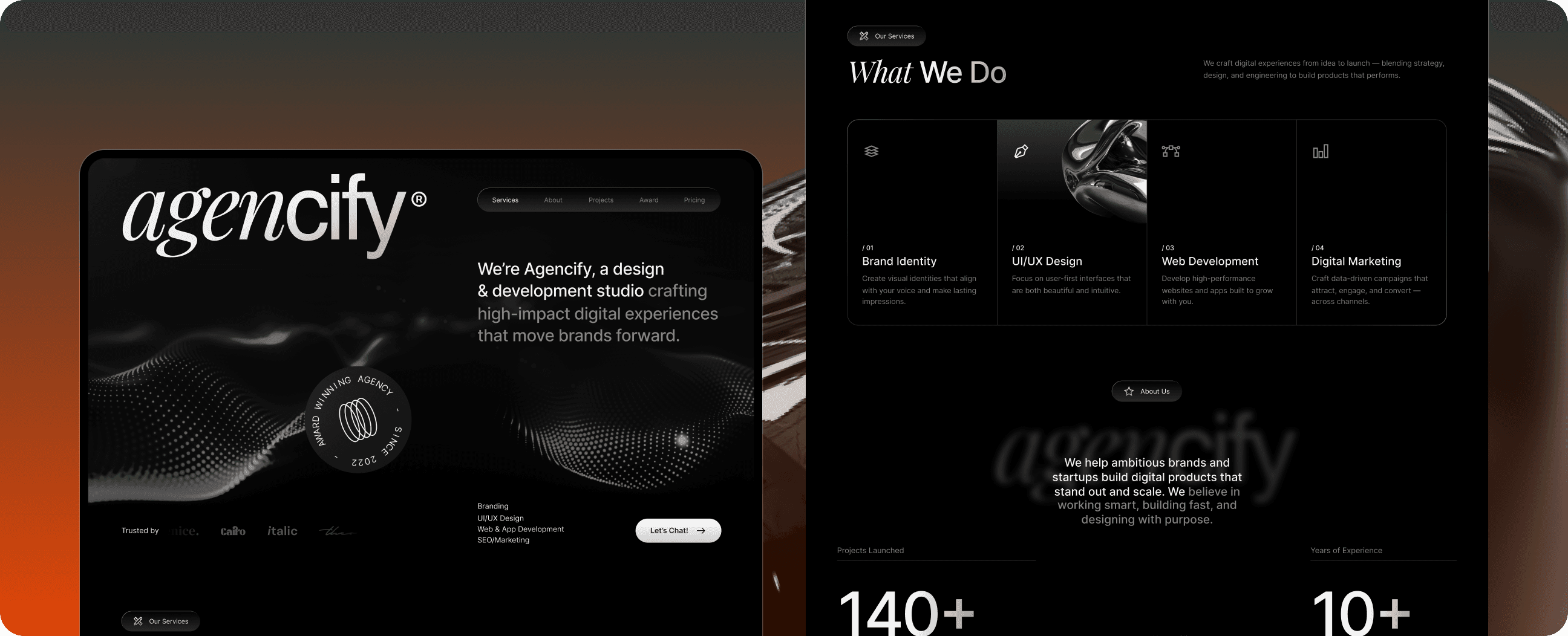
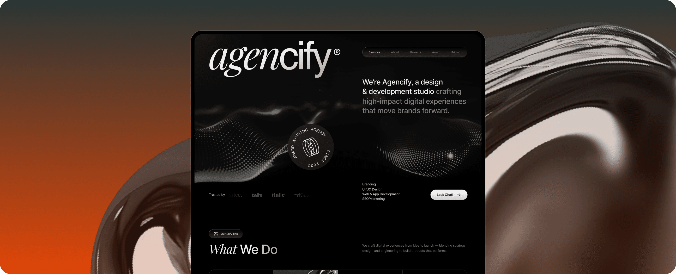
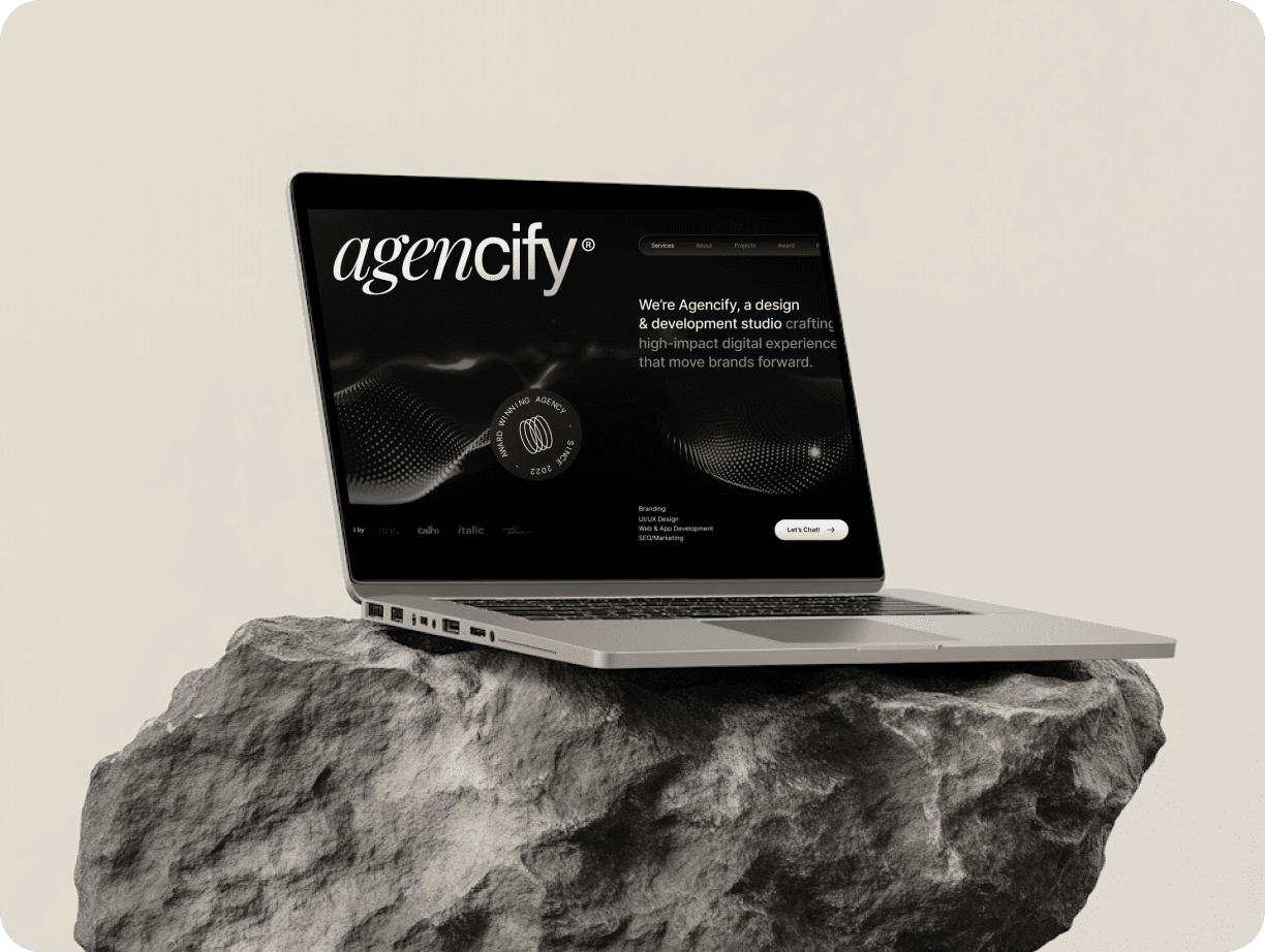
The core of our work lay in translating the refreshed identity into fully immersive designed a modular UI system that could flex with their content be it case study or service pages. Animations were used purposefully: subtle fades, smooth scroll state added energy without overwhelming the experience. Typography was care to balance structure with creativity, combining a bold sans-serif for headers with font. We created a custom icon set, layered in vibrant colors, and included micro throughout the site to enhance user engagement.
Every detail was intentional from the use of whitespace the sticky nav behavior The goal wasn’t just to impress — it was to communicate clarity and confidence. The final result was a site that doesn’t just show their work.
FINAL PERFORMANCE
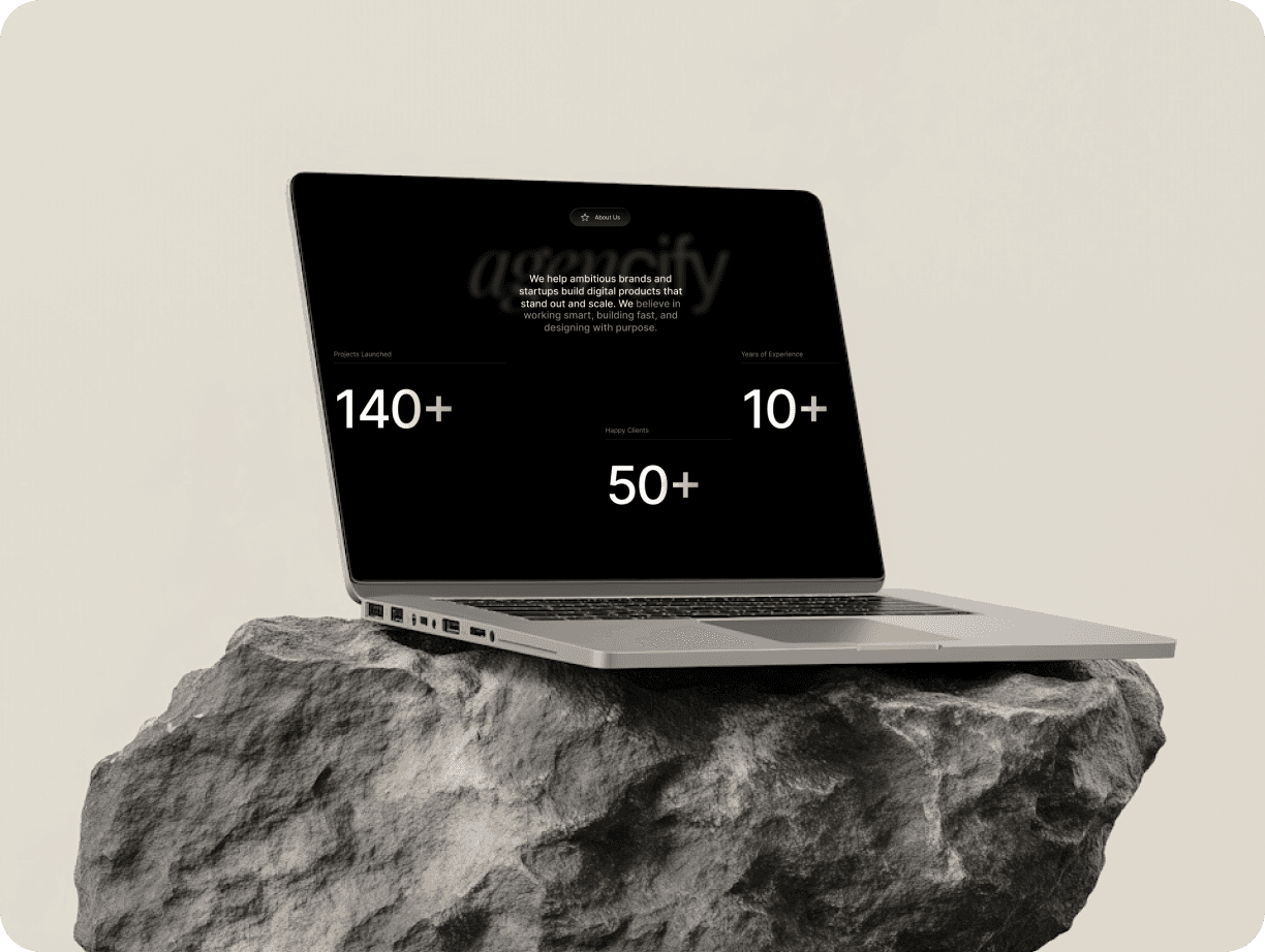
The result of the transformation were immediately visible both in perception and performance studio Vibe reported a 60% increase in client inquiries within the 3 months post-launch. Their social channels saw greater engagements due to the consistent and striking visual language Internally, their team reported a renewed sense of pride and ownership are finally had a brand reflected their passion and ambition. Their pitch decks looked sharper, their proposals more cohesive. The brand now speaks with clarity.