CANDREVA
Creative Agency Reimagined
Project Concept Label
FRAMER, UI/UX Design, Website
Project Type
INTRODUCTION
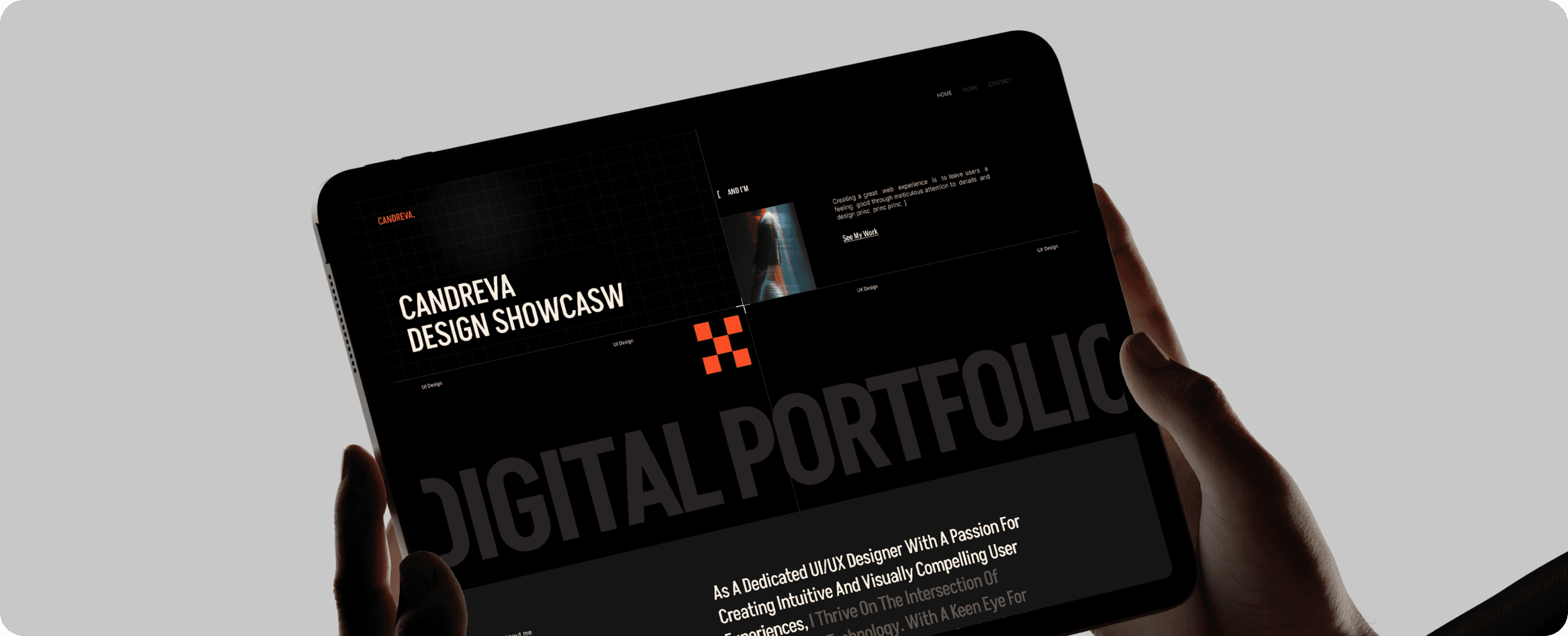
Candreva came to us seeking a complete overhaul of their digital identity — one that could reflect their evolution from a small agency into a bold creative powerhouse. Their previous visuals felt outdated and disconnected from the energy of their team and their work. The goal was simple: build a brand that captured their momentum and told a compelling story to clients at first glance.
DESIGNING METHOD
We began by constructing a versatile UI system that allowed the Candreva team to showcase their work with confidence and consistency. The use of dynamic layout structures, fluid animations, and intentional whitespace brought their content to life. From service pages to case studies, every section was designed to inform and impress — not overwhelm.
Typography played a huge role in the visual refresh — pairing a bold, contemporary header font with an approachable body typeface. We also introduced a vibrant yet sophisticated color system that stood out without being loud. Interactivity was key: subtle transitions and hover effects added a layer of polish while keeping the experience smooth and focused.
FINAL PERFORMANCE
Typography played a huge role in the visual refresh — pairing a bold, contemporary header font with an approachable body typeface. We also introduced a vibrant yet sophisticated color system that stood out without being loud. Interactivity was key: subtle transitions and hover effects added a layer of polish while keeping the experience smooth and focused.