TESLA
Creative Agency Reimagined
Project Concept Label
FRAMER, UI/UX Design, Website
Project Type
INTRODUCTION
Tesla’s internal design team approached us with a clear goal — to create a showcase site that reflected their innovation, precision, and design-forward thinking. This wasn’t just about cars. It was about designing an experience that matched the emotional and futuristic feel of the Tesla brand. Our objective was to create a digital space that felt fast, fluid, and distinctly “Tesla.”
DESIGNING METHOD
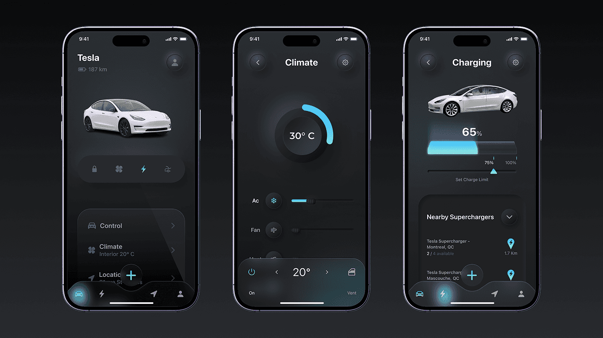
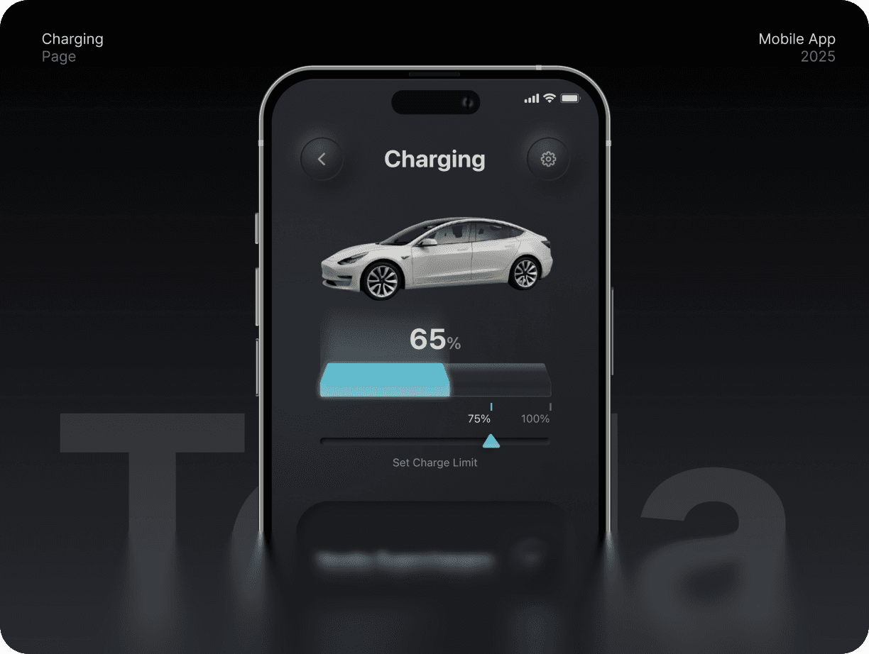
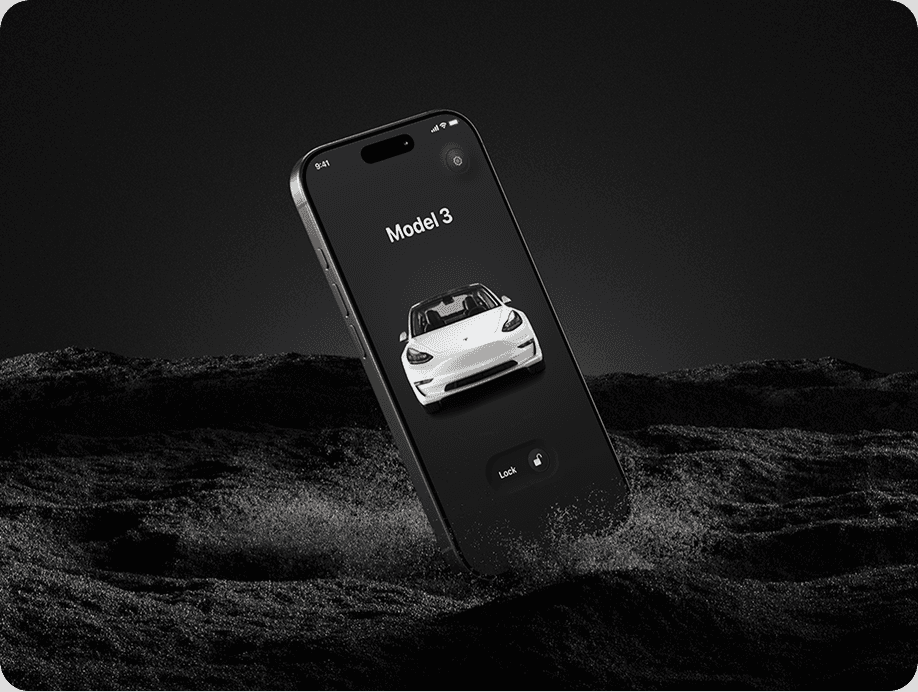
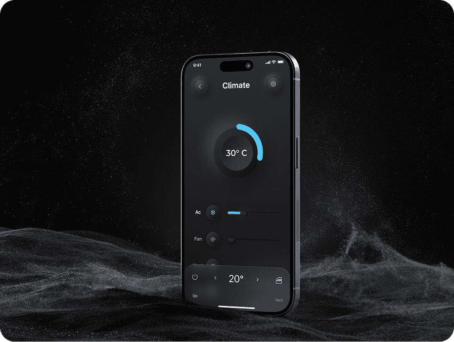
We crafted a high-performance layout using modular components built in Framer, ensuring seamless transitions and smooth animations. The interface was stripped of all unnecessary elements — bold, clean, and immersive. A dark theme set the tone, supported by sleek motion and full-screen visuals. We used Tesla’s own typography and iconography, repurposed carefully into a modern web framework.
Speed and usability were at the forefront. Pages loaded in milliseconds, scroll felt frictionless, and the user journey was hyper-focused. We created subtle visual cues — from scroll-based animations to hover-sensitive product cards — to elevate the user’s sense of control. The result was a UI that felt as engineered and forward-thinking as Tesla’s technology.
FINAL PERFORMANCE
The microsite received acclaim both internally and across the Tesla design community. Engagement time nearly tripled compared to previous launches, and the feedback highlighted how well the experience captured Tesla’s spirit. Internally, the design team saw the project as a new benchmark — proving that storytelling and performance can live in perfect sync.